First of all, it’s important to note that we don’t keep records of where data has gone. There’s a couple of reasons for that. Firstly, your privacy. Secondly, it would require a HUGE amount of space to store all the information.
The best tool we’ve got to help work out what’s using your data is our awesome customer portal My.Uber. Our amazing developers have packed it with heaps of useful stuff, like the ability to add on data packs to your connection, access to online copies of your invoices, breakdowns of your calls and the almighty ‘Devices’ tab and broadband graph.
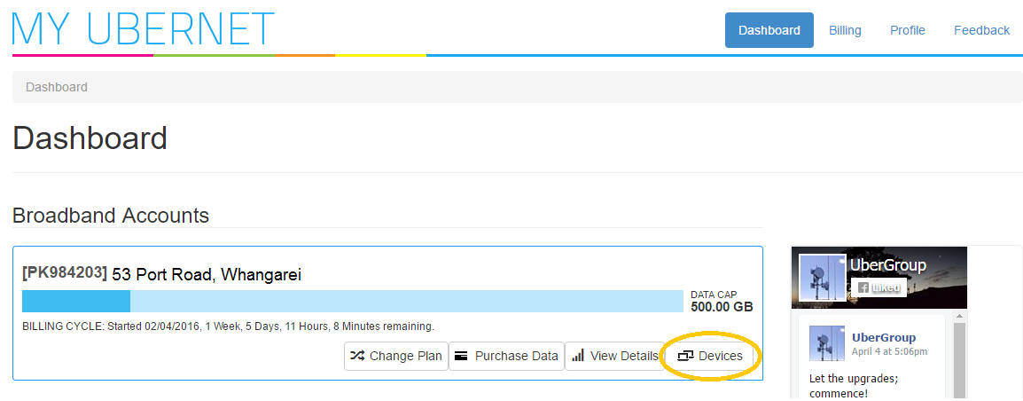
The first tab we will go over is the ‘Devices’ tab.
This shows a clever list of all the devices that have been connected to your internet connection over the past three days. There are a number of things there to help you work out exactly what device is which. The first is the device name, combined with the type field you should be able to put two and two together to work out what device belongs to who. If you want to go into Sherlock Holmes mode, the MAC Address is a unique number for each device, a finger print of sorts, that will allow you to work out exactly which device is which.
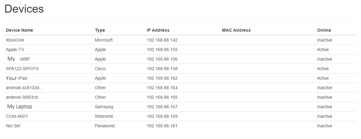
It also shows if they’re currently connected (active) or not (inactive). The online status updates every three minutes, so you can work out within a few minutes who’s currently online.
If you see some devices that are on the list that you’re not sure are yours or that you know belong to someone who you don’t want using your internet the best thing to do is change the password on your wireless router.
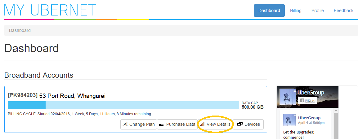
Now that you’ve got a fair idea of what’s connected, the next thing is to see when the data was used and what type of traffic was used. To do this you’ll need to go back to the dashboard, then to the ‘View Details’ tab.
Here you’ll see the usage graph. This shows day by day the amount of data that was used across the connection.
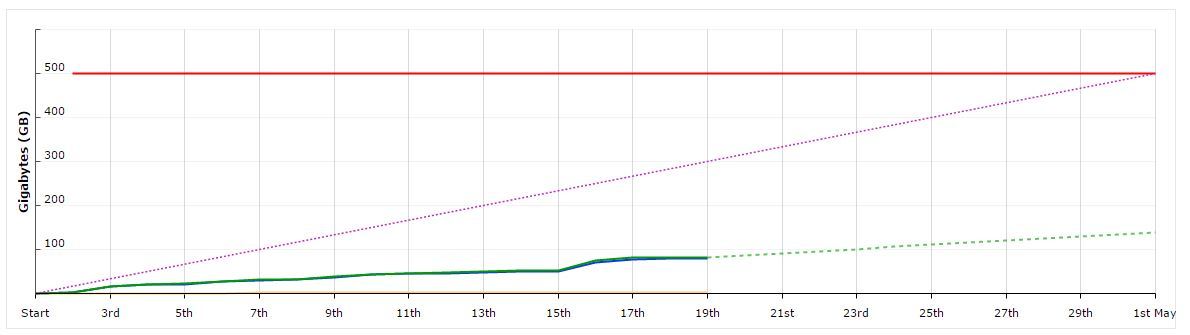
The lines all mean something really important and aren’t just there for visual effect. The yellow line near the bottom shows the total amount of data that has been uploaded, the blue shows the total downloaded (we’ll chat about the differences below) and the solid green line shows the total. The dashed purple line shows roughly where you want to be sitting if you don’t want to overshoot your data cap. The dashed green line shows an estimate based on your previous usage of how much data you’re going to end up using.
This graph is pretty steady, and they’re way below their data cap.
This one however, isn’t.
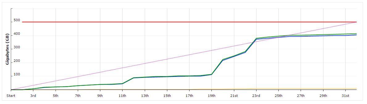
As you can see there’s been a number of big spikes in usage. These are represented by the steep inclines. What would cause an incline like this? Here’s a few examples.
Spikes in download traffic
Download traffic is information that has been received by the connection. A few examples of this could be:
- Downloading Windows Updates (Windows 10 especially!)
- Software updates
- Downloading music
- Streaming Netflix or Lightbox all day in HD (it is coming into movie season, after all)
- Downloading games onto gaming consoles or Steam (ask your kids, they’ll understand)
- Downloading movies from the likes of iTunes
- Downloading large files
Spikes in upload traffic
Spikes in upload traffic are less common, but do still happen. Upload traffic is that which is sent from your connection, to the internet. The worst part is that they usually happen in the background without your knowledge and your first indication that something is up is an email from us letting you know that your getting close to your data cap. Here’s some of the usual suspects:
- DropBox, Google Drive, iCloud
- Torrents left seeding in the background
- Twitch streaming (again, ask your kids)
- Uploading content to YouTube
All of the above should help you identify where your data may have gone. If you’re still not sure, or just want to have a chat about your usage you’re most welcome to give us a call on 09 438 5472 or email us on ultrafast [at] uber [dot] nz and have a chat with our super friendly Customer Service and Tech Support teams (all of whom speak normal English and won’t baffle you with big scary tech words!) We’ll be more than happy to help you work out who’s been using your data. The results might even surprise you!
