Here at Uber we’re all firm believers that the internet is awesome! Being the avid users that we are we’re always coming across so many amazing tools, informative resources, and cool sites that we think you guys might also be interested in.
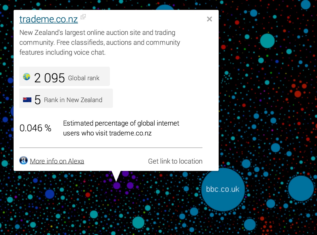
Believe it or not there is more to the internet than Facebook and TradeMe! In this post we’re going to take a look at what would happen if you laid out all of the worlds biggest and most popular websites on a page together creating a map of the internet. That’s exactly what the team at The Internet Map have done.

Like any other map, The Internet map is a way of displaying objects’ relative position; but unlike real maps the objects shown on it are not aligned on a surface. Mathematically speaking, The Internet map is a bi-dimensional presentation of links between websites on the Internet. Every site is a circle on the map, and its size is determined by website traffic, the larger the amount of traffic, the bigger the circle. Users’ switching between websites forms links, and the stronger the link, the closer the websites tend to arrange themselves to each other. The map is really interesting and is a good way to spend a few minutes or so exploring around and getting a sense of just how vast it is!